
The Main Event
by KC Fonts · Website
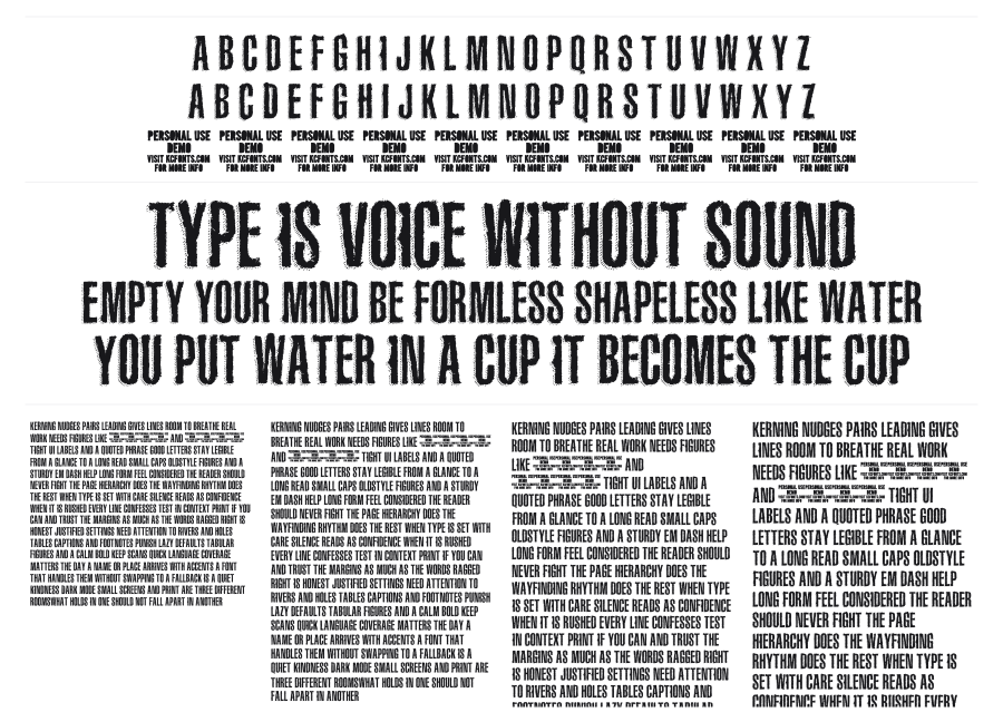
The Main Event is a bold, condensed uppercase face from KC Fonts with a heavy grunge texture baked into every letterform. The narrow proportions pack a lot of visual density into tight spaces, while the rough, distressed edges give it the feel of worn-out fight posters or wheat-pasted flyers left in the rain. Built for headlines and poster work where you want something that reads as loud and battle-tested.
Preview


Related fonts

8th Cargo
imagex · 285 downloads

84 Rock!
Jonathan Paquette · 277 downloads

Rat Man Bane
OMEGA Font Labs · 148 downloads

After Shock
Shy Fonts · 138 downloads

Extraction
Ænigma Fonts · 136 downloads

FFF Tusj
Magnus Cederholm · 124 downloads

Youthquake
Pizza Dude · 103 downloads

Bleak Chop
Laurence Kernan · 60 downloads

About Dead
Paula Baptista · 58 downloads

3D Noise
Alf Nielsen · 57 downloads

10 Minutes
Pizza Dude · 56 downloads

Barrelhouse All Caps
Cumberland Fontworks · 56 downloads