
Better
by Vladimir Nikolic · Website
Better is a thin outline typeface by Vladimir Nikolic with geometric, art-deco-inflected letterforms that feel both elegant and distinctly modern. The uppercase-only design keeps things sharp and structured, with delicate open strokes that need room to breathe at larger sizes. A strong pick for headlines, posters, and editorial layouts where you want something refined but visually striking.
Preview


Related fonts

Bramalea Beauty
Ray Larabie · 59 downloads

Almost Japanese Cartoon
Galdino Otten · 56 downloads

Brutality
Pizza Dude · 56 downloads

Almost Japanese Smooth
Galdino Otten · 55 downloads

Bio Disk
Iconian Fonts · 55 downloads

3D
Paula Tennet · 54 downloads

80er Teenie Demo
anke-art · 54 downloads

Aberforth Outline
Brittney Murphy Design · 54 downloads

Baveuse 3D
Ray Larabie · 54 downloads

Cheap Pizza
Marianfudge · 54 downloads

Blind Melon
Pizza Dude · 53 downloads
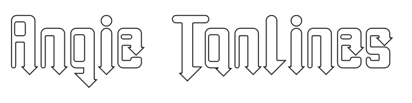
Angie Tanlines
Grey Wolf Web Works · 52 downloads