
Sharpe
by M�ns Greb�ck · Website
Sharpe is a bold, high-contrast serif from Måns Grebäck that pulls from the Didone tradition but pushes the weight further than most, with thick verticals and razor-thin hairlines that create serious visual tension. It has the editorial elegance you'd expect in fashion magazines and luxury branding, but the heavy strokes give it more authority than a typical Didone. Built for headlines and display use where drama and refinement need to coexist.
Preview


Loading…
Loading…
Loading…
Loading…
Loading…
Loading…
Loading…
Related fonts

Nouvelle Vague
Dirk Schuster · 255 downloads
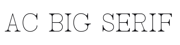
AC Big Serif
Adrian Candela · 56 downloads
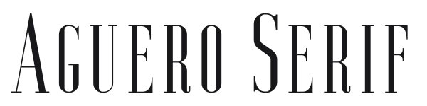
Aguero Serif
Craft Supply Co. · 55 downloads

Agatha
Yai Salinas · 53 downloads

Aleijadinho
Matias Romero · 52 downloads

A Bit Empty
Marcin Leśk�w · 50 downloads
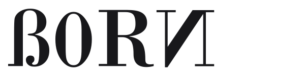
Born
i2design · 50 downloads

806 Typography
Leonard Posavec - LeoSupply.co · 49 downloads

Angelic Serif
Dirt2.com - SickCapital · 15 downloads

Dream Orphans
Ray Larabie · 6 downloads

Putain
Shamrock · 6 downloads

Afecta
Ilham Herry · 5 downloads