
Tower Blocks
by I Like Fonts
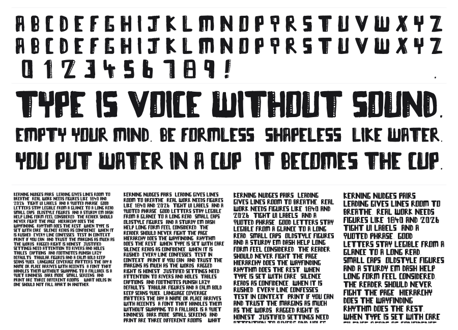
Tower Blocks is a heavy, uppercase display face from I Like Fonts with a rough, textured surface that looks like it was printed on concrete or left out in the rain. The bold letterforms carry serious visual weight, but the grunge treatment keeps things from feeling too clean or corporate. Built for posters, headlines, and album art where you want something that feels loud and a little worn down.
Preview


Related fonts

8th Cargo
imagex · 286 downloads

84 Rock!
Jonathan Paquette · 279 downloads

Rat Man Bane
OMEGA Font Labs · 149 downloads
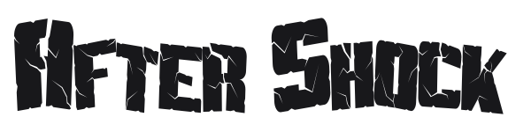
After Shock
Shy Fonts · 139 downloads

Extraction
Ænigma Fonts · 137 downloads

FFF Tusj
Magnus Cederholm · 124 downloads

Youthquake
Pizza Dude · 104 downloads

Bleak Chop
Laurence Kernan · 61 downloads

3D Noise
Alf Nielsen · 59 downloads

About Dead
Paula Baptista · 59 downloads

10 Minutes
Pizza Dude · 57 downloads

Barrelhouse All Caps
Cumberland Fontworks · 56 downloads