Eri Serif
by Carlos Barbosa
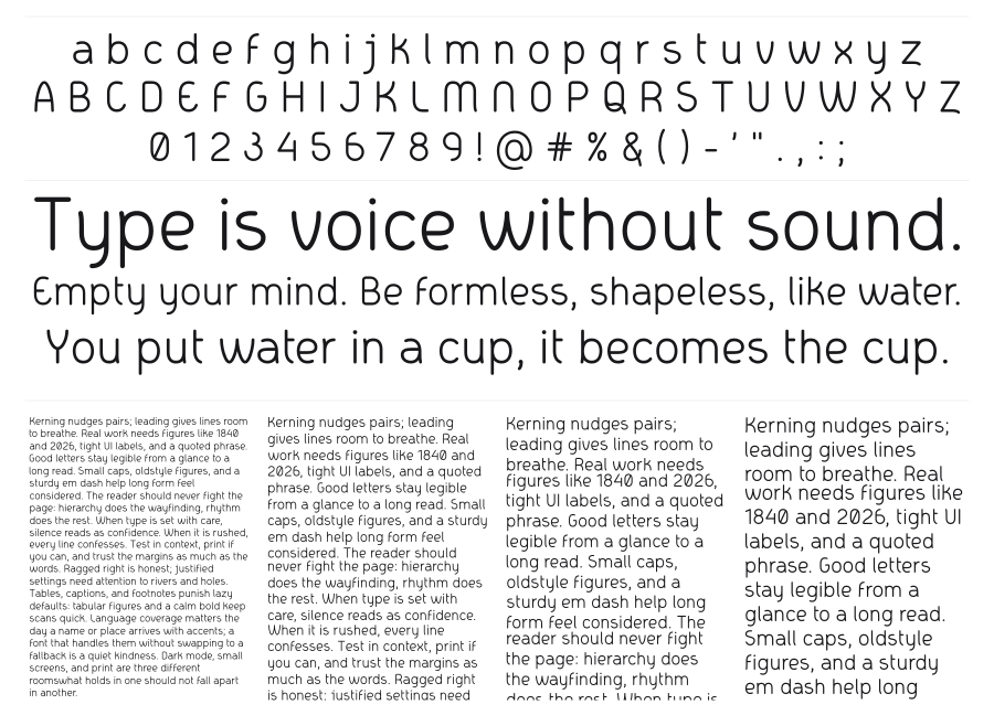
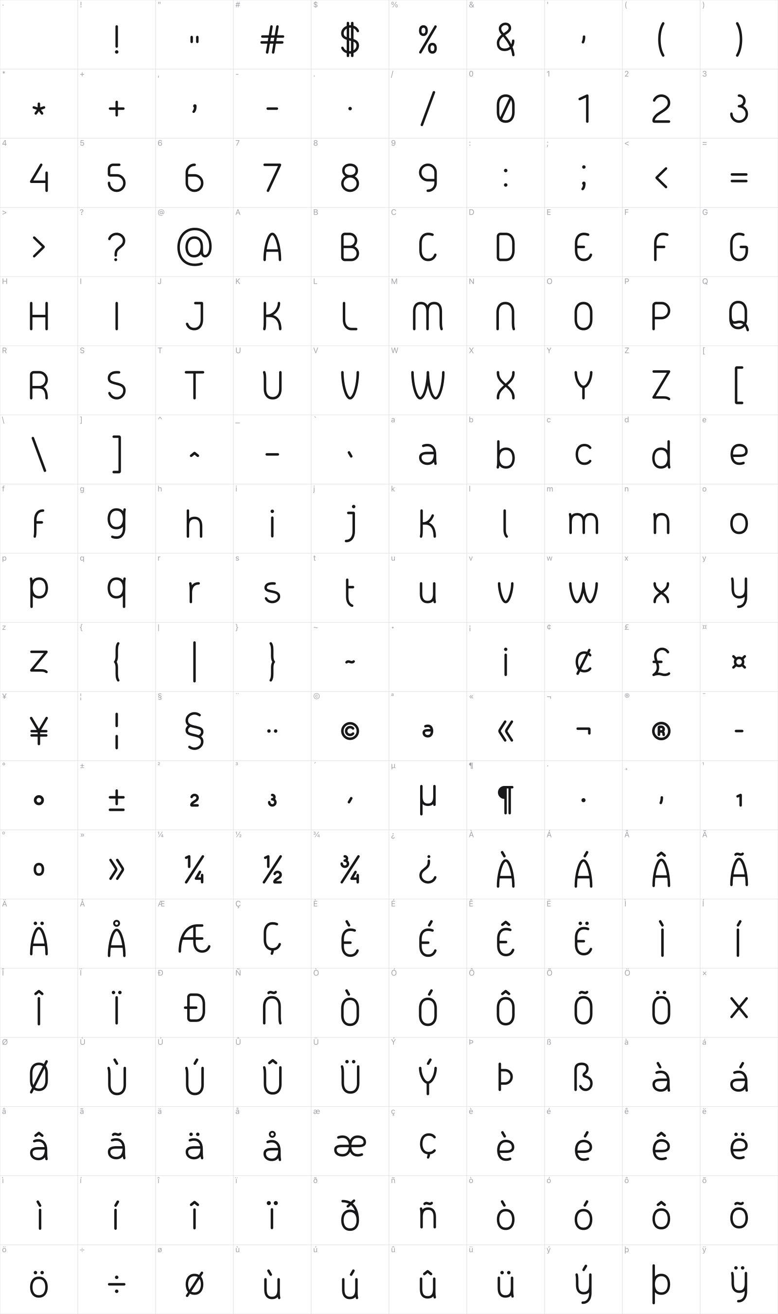
Eri Serif is, despite its name, a rounded sans-serif with soft terminals and a light, near-monoweight construction. The gentle curves and open apertures give it an approachable warmth that works across both display and body text settings. It sits comfortably in branding, editorial, and UI contexts where clean but not cold is exactly the right tone.
Preview
Live sample
0/180

Loading…
Loading…
Loading…