
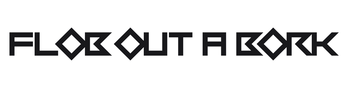
Flob Out a Bork
by Chequered Ink · Website
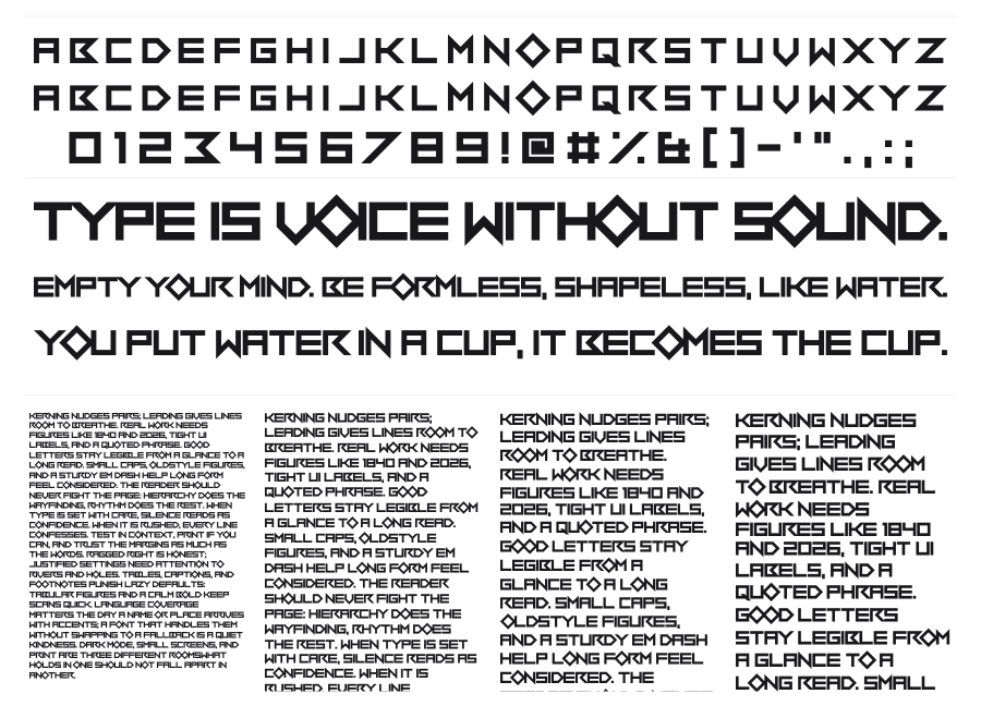
Flob Out a Bork is a bold geometric techno display face built from sharp angular cuts and triangular notches that give the letters a modular, almost mechanical quality. The wide, square construction and heavy weight push it firmly into headline and logo territory. Strong choice for gaming, sci-fi, and entertainment branding where attitude matters.
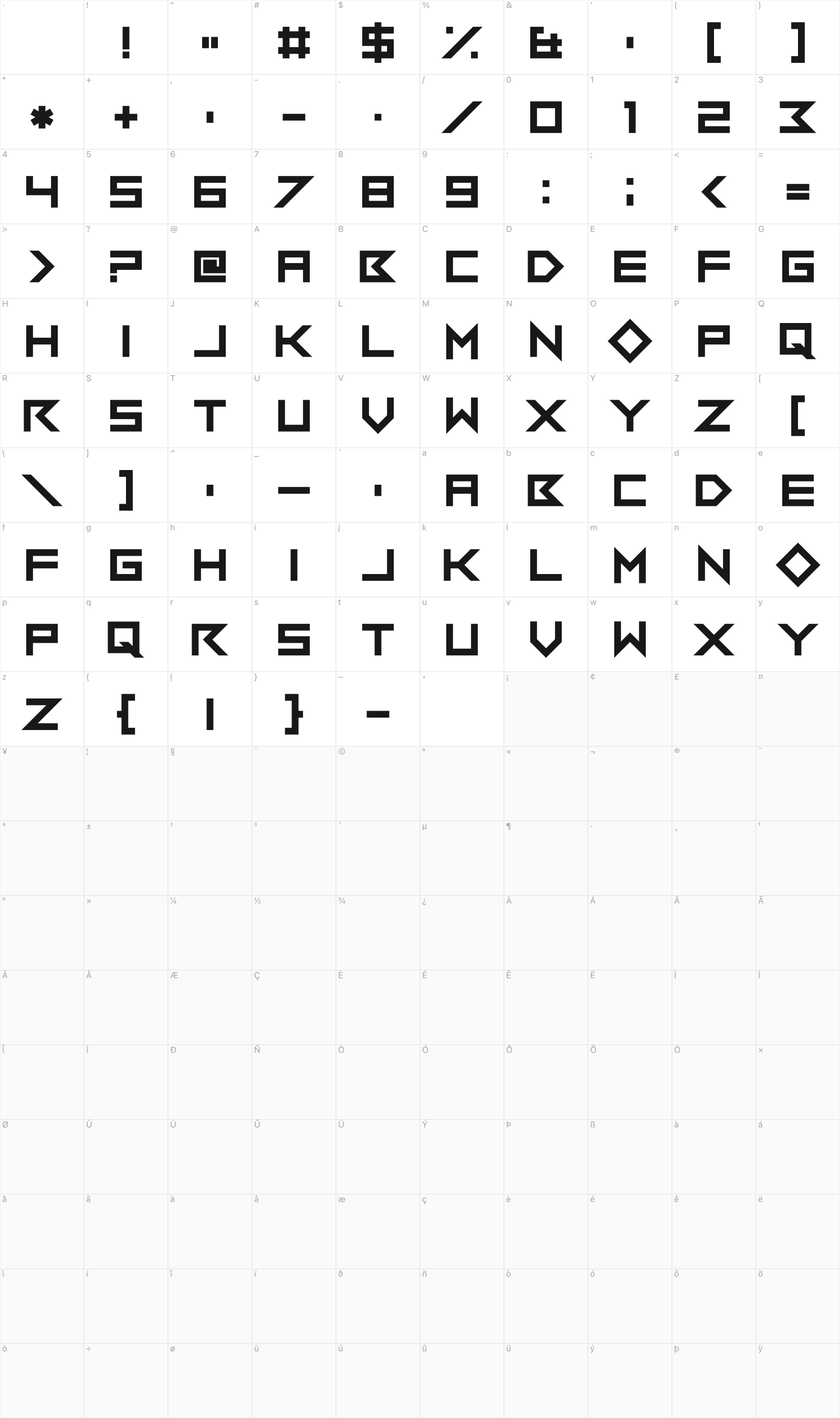
Preview
Live sample
0/180
Related fonts

911 Porscha
Iconian Fonts

1968 Odyssey
Iconian Fonts

Atarian
Shy Fonts

1st Enterprises
Iconian Fonts

Dark Wind
Iconian Fonts

Alphabet SNK by PMPEPS
Imran Nasution

001 System Analysis
Yellowyellow

5 Contrastio
Winter Design Studio

5 Fatal Error
Winter Design Studio

2015 Cruiser
Pixel Sagas

4KSTNCL
Neoqueto

5 Computerized
Winter Design Studio