Kei
by Arutype Studio · Website
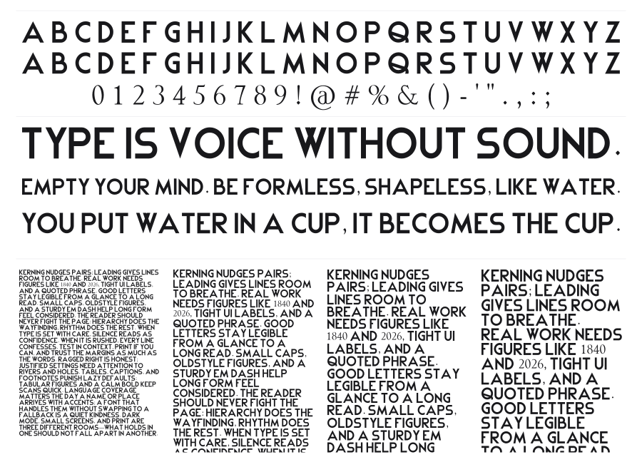
Kei is a clean geometric sans-serif with a friendly, playful personality built from simple, open forms. Subtle quirks in the construction — like slightly softened angles and a relaxed rhythm — keep it from feeling stiff while maintaining legibility at display sizes. It works across kids branding, cafe signage, social media headers, and casual event graphics.
Preview
Live sample
0/180