
Tomino
by Måns Grebäck · Website
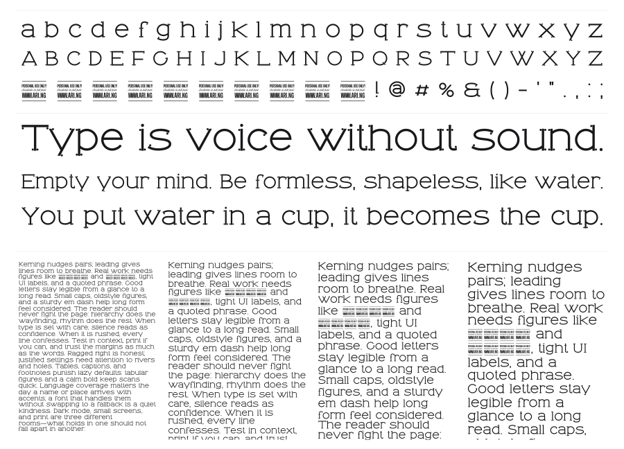
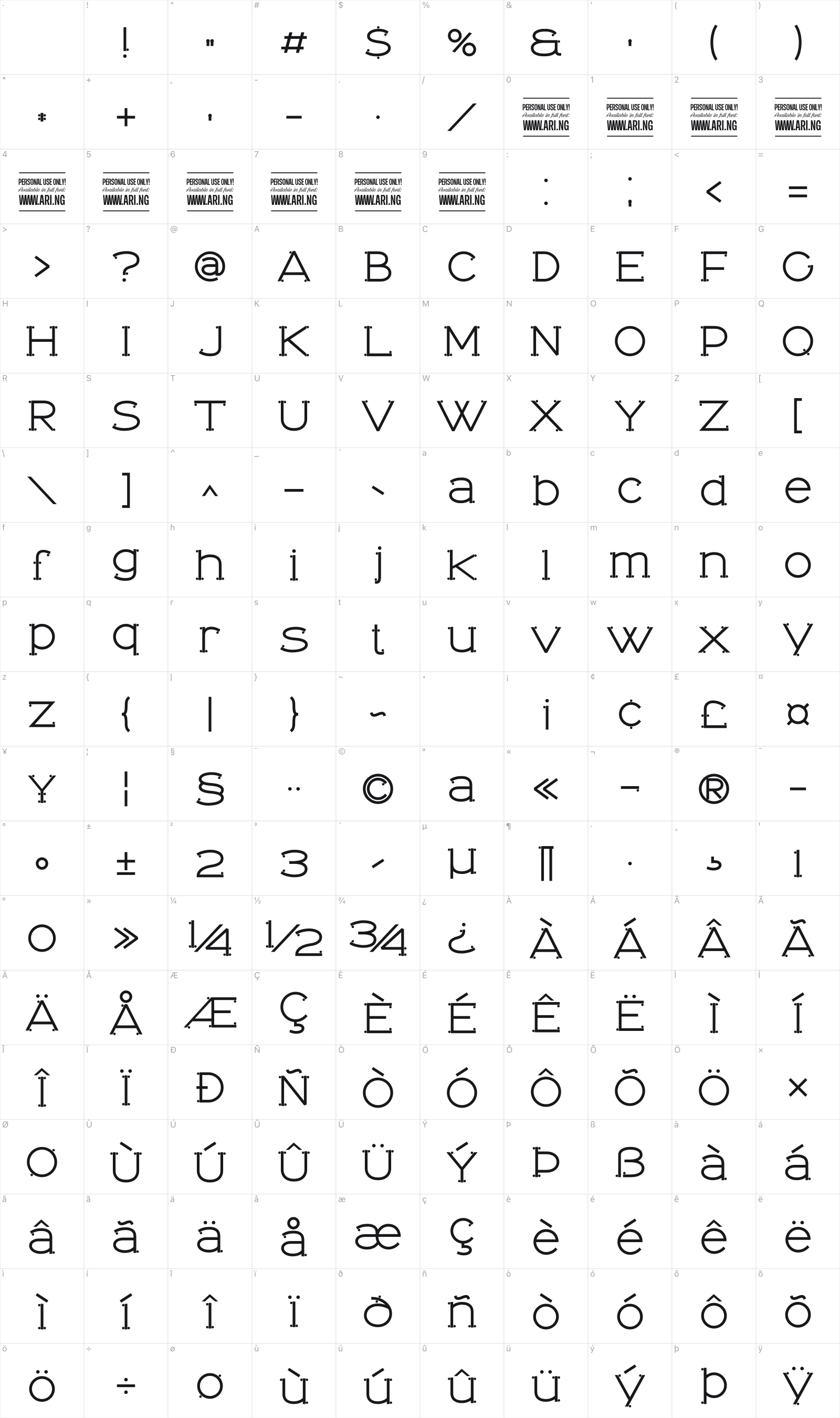
Tomino is a dot serif by Måns Grebäck, a sans-serif construction where traditional serifs are replaced by small, uniform circles at every terminal. The result is airy and a little whimsical, with wide proportions and low stroke contrast that keep it legible even at smaller sizes. It sits right at the boundary between decorative and functional.
Preview
Live sample
0/180

Loading…
Loading…
Loading…
Loading…
Loading…


