Utendo
by LyonsType · Website
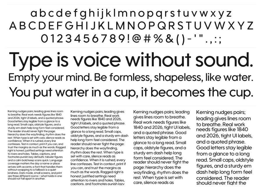
Utendo is a geometric sans-serif drawn directly from Nintendo's Wii U-era logotypes, particularly the Nintendo Network mark. It captures the clean, rounded neutrality of corporate tech lettering with a near-monoweight stroke and softly finished terminals. Regular and Bold weights cover the two definitive styles from those original logos, with a Cyrillic extension and a set of Wii U platform symbols bundled in.
Preview
Live sample
0/180